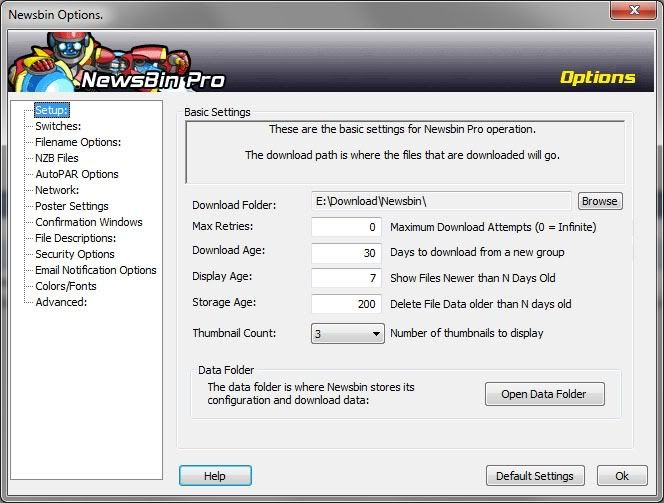
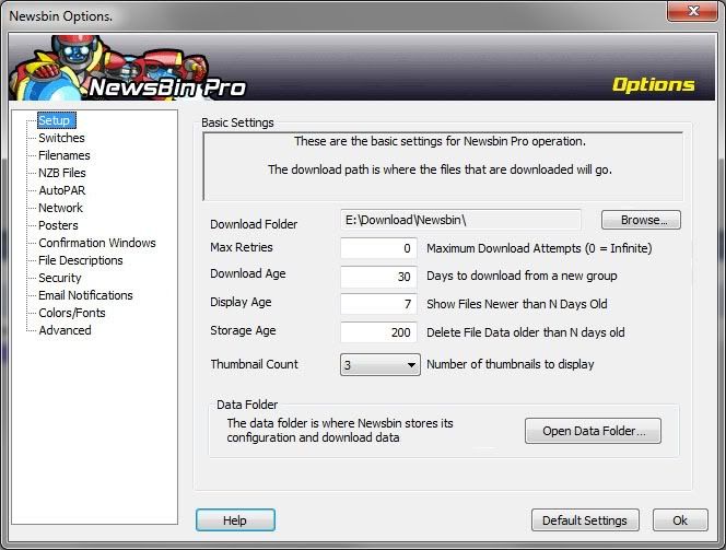
Then there's an inconsistent naming convention. Why is one menu called "Poster Settings", another one "Filename Options" and another one just "Advanced"? Since they're all Options (hey, that's why it 's the Newsbin Options window), you can simplify the menus by leaving out "Options" and "Settings" altogether. And then there a number of command buttons with advanced options that should have elipses.
Here's the current Options window:

and here's the improved one:


