About the GUI ...
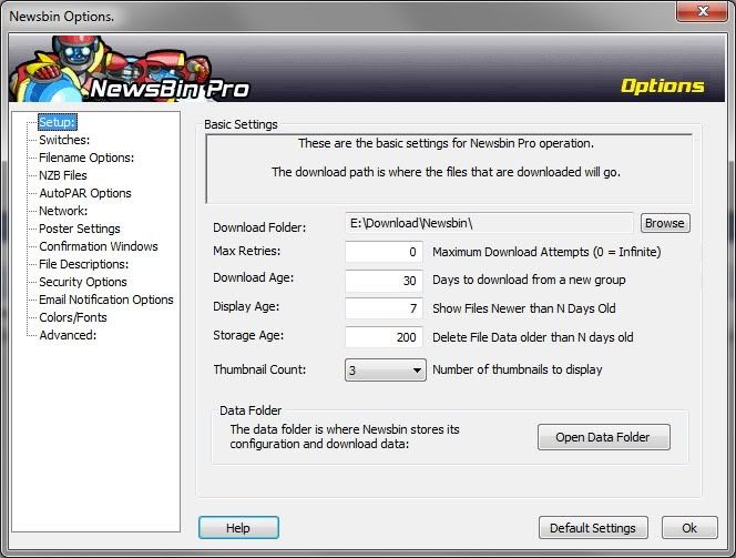
I think the Newsbin UI could be tidied up a bit. I was looking for the option to turn off the error popup window and I noticed that the Newsbin Options window didn't conform to most Windows UI conventions. Most options had colons (but not all of them) but there's really no need for those colons at all. Check a modern Windows program and you see they don't use them.
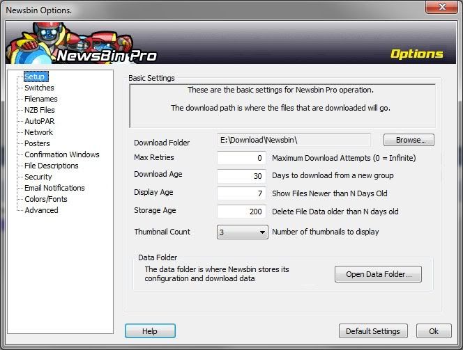
Then there's an inconsistent naming convention. Why is one menu called "Poster Settings", another one "Filename Options" and another one just "Advanced"? Since they're all Options (hey, that's why it 's the Newsbin Options window), you can simplify the menus by leaving out "Options" and "Settings" altogether. And then there a number of command buttons with advanced options that should have elipses.
Here's the current Options window:

and here's the improved one:

Then there's an inconsistent naming convention. Why is one menu called "Poster Settings", another one "Filename Options" and another one just "Advanced"? Since they're all Options (hey, that's why it 's the Newsbin Options window), you can simplify the menus by leaving out "Options" and "Settings" altogether. And then there a number of command buttons with advanced options that should have elipses.
Here's the current Options window:

and here's the improved one:
